


What’s not always appreciated is that genuinely good quality colour photography has been possible since the late 1800s. It was never as common as monochrome, but there were several usable if expensive processes that with care could produce excellent results. Some were quite widely available. The problem was reproducing the results: colour separation for printing wasn’t really up to the job yet, so most early colour photographs were viewed by projection onto screens, in cinemas or homes.
Also, colour dyes are far less stable than the silver halide crystals of black and white, and they fade quite rapidly over time. They fade at different rates too, so colour balance goes haywire. So, if you do find an old original colour photograph from 80 to 120 years ago, chances are it won’t impress you.
Restoring old glories
Stuart Humphryes is doing his best to change that. In the past few years he’s developed a hobby of enhancing original colour photographs into a very popular online presence, mainly under the name BabelColour @StuartHumphryes on X/Twitter. He has 203,000 followers, including Printweek staffers and your author here. Some 256 enhancements have just been printed in his first book, of which more below.
Humphryes emphasises in his postings that these are real colours from 100-plus years ago, that have been restored and enhanced, not colour added to monochrome. Often he can bring century-old images back to much more than their original glory, with vibrant glowing colours that look entirely modern. He says it’s “as if a time-traveller has captured history on an iPhone.”
The subjects range from studio and outdoor still lives and portraits, through street scenes showing everyday lives to landscapes. Most were taken in the UK and Europe but some were from the US, North Africa, the Middle East and further afield across India and south east Asia to Japan. Their dates mostly range from 1900 to the early 1930s, with one from 1949.
“It all began during lockdown, in 2020, when I first posted an Autochrome clean-up on Twitter,” Humphryes told Printweek. “The reaction was amazing, with a lot of interest and engagement and a great deal of positive feedback. It encouraged me to do another and then another and that is how such things snowball. I found my follower numbers rapidly rising and within a couple of months had 100,000, continuing to grow over the last couple of years. There seems to be a genuine fascination and appetite for the work!”
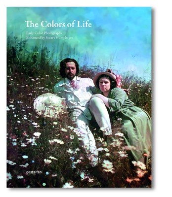
The Colors of Life
 He hadn’t originally intended to produce a book, but many followers were asking for one. “It was purely a happenstance that the publishers Gestalten emailed me at a time I was more open to the whole notion,” he says.
The approach came in April this year and the result, by September, was a lavishly produced hardcover book of his enhancements, called The Colors Of Life.
There are 256 portrait pages in an A4-plus format of 30x24cm, with mostly full-page images, allowing for different film formats. It was produced by Printer Trento in Italy in a first run of 10,000 hardback copies, and you can still order one online from Gestalten for £45, or it has to be said, £10 cheaper from Amazon.
While the print, and reproduction quality is very impressive, he’s a little disappointed by the information presented in the book, or rather the lack of it. The publishers didn’t want to show any before and after comparisons, or even ask him for explanations of how he did them, he says.
How does he do it?
Maybe we can redress that a bit. So, how does he produce such stunning, realistic colour? “My photographic clean-up techniques were all self-taught using trial and error. I have been a keen genealogist for several decades, and repairing old photographs of my ancestors honed my restoration skills.
“I also had a previous life as a colouriser, adding colour to monochrome photos for newspapers and magazines, as well as film colourisation techniques on old television recordings for the BBC, and this experience with colourisation gave me a good foundation of understanding of colour balance and saturation, which was a transferable skill when repairing early colour photography.”
There were several different colour processes around in the early 20th century and there are examples of several in the book. “Each process certainly has a very different feel and look and each presents unique challenges,” says Humphryes. Most of what he works with are Autochromes, released by the pioneering Lumière brothers’ company in 1907 and popular until the 1930s.
Humphryes explains: “These images filtered colour by using finely ground potato starch, granules which had been stained in three different colours – violet-blue, orange-red and green. These coloured granules were thoroughly mixed and spread over glass plates which sandwiched them, filtering out their respective colours from the light entering before it hit the silver halide light-sensitive layer.”
Double-processing turned the negative to positive, so the original was used to view the colour image via a reflecting hand viewer or a projector (or later scanner) Viewed up very close, the images have a granular look of thousands of tiny dots of colours, rather like a printed halftone. Zooming-in causes the detail to fall apart and become increasingly spotty, which is a challenge when scanning and restoring them.
Algorithmic assistance
“Advances in computer software and algorithmic coding encouraged me to experiment with cleaning up and rebalancing early Autochrome images, using these algorithms to average out the differences between adjacent pixels, which smoothed out the granular pixilation of the Autochrome process and gave a more modern digital look to the images,” Humphryes says. “This allows people to digitally zoom into the images on their devices without the detail breaking up into tiny dots.
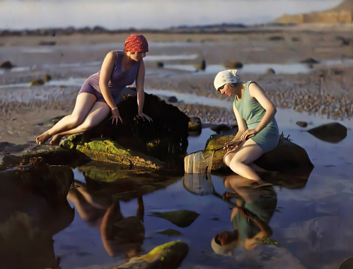
Bathers at Siouville-Hague in Normandy, France, photographed by Gustave Gain, 1921, and enhanced by Humphryes
“Over time, the dyes of old Autochrome plates deteriorate and fade at different rates, so the image hues can become unusually biased, either becoming very red or very yellow. By boosting different colour channels digitally, I can revitalise different colours individually and so return the old plates to their original chroma levels.”
Colour enhancement is only part of what Humphryes does to restore the old photographs. “That process begins with a thorough clean-up, often zoomed incredibly far into the image and adjusting things on a pixel-by-pixel basic, repairing damage and tears and cracks and spots. When it is thoroughly cleaned, I look at the mid-tones and contrast and get a feel for how ‘flat’ an image looks, and I then adjust levels to give better dynamic range. I adjust the overall saturation levels to make faded images more vibrant, but concentrate much more on individual colour channels, to achieve more life-like colours and remove staining and hue-bias. I am always endeavouring to make the images look more contemporary like modern photos.
“I use algorithms to remove the spotty, granular look from Autochromes and then neural networking to enhance the detail. It is a suite of different procedures and programs to tackle specific issues. I do all the clean-up, manually adjusting pixels with brush tools, but the ‘de-noising’ is an automated algorithm. Sometimes it is too harsh and aggressive, and I have to overlay and mix the algorithmic version with my cleaned-up base version to allow some of the grain to show through. The technique is definitely evolving all the time to improve the end results. Some of my early work is very naive and basic, I think.”
Online sources
Humphryes says he never actually scans old colour originals, but finds them all online. “I spend a very long time trawling the Internet to find scans of Autochromes which may benefit from my enhancement process. Lots of forums and online galleries – it’s like the artistic version of the Dark Web! I am mainly drawn to images which have nice lighting. It is as vague and simple as that. If I like the lighting in an old photo I am motivated to enhance it.”
There have been the odd detractors though, he says. “In the early days I did encounter some vitriolic objections from photo-enthusiasts and purists who thought I was conducting sacrilege on precious historical artefacts. But I am not erasing the existence of the original Autochromes, I am merely taking images which have been accessible for over a hundred years and reimagining them for a modern audience, stripping away the decay and visual artefacts of their manufacturing process and presenting them as clean, high-definition images which look modern and unfettered by time. They allow the viewer to connect much more emotionally to people of the past, who look like they’ve only just been photographed. It has proven itself a very popular technique!”
It’s certainly keeping him busy, with new images still posted as BabelColour quite frequently. “It is also an artistic escape for me, as my day-job is far from creative,” he says. “I am an administration officer for local government and process planning appeals. It is a technical and dry process and so I use my photographic work as a form or artistic release! It gives me every bit as much pleasure creating the enhancements as that experienced by those who follow the work. It is a mutual, symbiotic pleasure and long may it continue!”


