1: Wieden & Kennedy display knit wit for Nike
 In China’s major cities everything is big. As a result, marketers have to think up ingenious ways to cut through the noise and devise disruptive campaigns that are a little out of the ordinary. That was certainly the case with Nike when it commissioned Wieden & Kennedy’s Shanghai office to create a new billboard campaign promoting the new Nike Free Flyknit trainers. Rather than just print a bog-standard poster showing a pair of the trainers, Wieden & Kennedy came up with an innovative idea for an outdoor stunt using a striking minimalistic image of a bare foot as the starting point.
“To feature the second-skin fit of the Flyknit construction and the ultimate flexibility of Nike Free, we decided to ‘knit’ the latest Nike gear thread by thread over a bare foot in the central commercial downtown of Shanghai,” explains Elena Zhang from Wieden & Kennedy Shanghai.
Essentially, four installation experts wearing Nike gear abseiled down the face of the billboard, which was prominently placed on one of the city’s busiest streets, and over the course of 10 days ‘knitted’ a Nike Free Flyknit trainer, thread by thread.
“This outdoor stunt highlighted the construction and lightweight feature of the product by making use of the installation process,” says Zhang. “It also generated attention from the crowds in the street. People took pictures of the construction and tweeted them. The outdoor stunt generated buzz both offline and online for the launch of the new range.”
2: News scent-sation
 Brands have employed sensory marketing techniques for years, with the most commonplace example being perfume encapsulation in high-end fashion magazine print ads. However, global FMCG behemoth Johnson & Johnson wanted to try something a little bit out of the ordinary when it launched a new campaign for its baby care products in India.
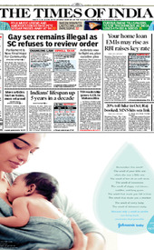 The company appointed communications company OMD India to conjure up full-page advertisements in a number of Indian daily newspapers – including The Times of India – with a difference. Johnson & Johnson wanted the smell of its baby powder to be infused into the adverts.
As part of a pilot scheme in Mumbai, OMD supplied a newspaper printer with Johnson & Johnson’s chosen fragrance. By employing a “special technology” the printer was then able to infuse the smell into the ink used to print the paper.
“The newspaper was printed as per the usual procedure,” says Mamatha Morvankar, managing director of OMD India. “Then a double-nozzle technology was used to spray the fragrance of the powder. The double-nozzle method releases double the force and has a long-lasting effect. A machine was used to spray the scent on pages one and two. Every copy was sprayed using this procedure. Prior to the release of the advertisement, a test-run was executed on a few copies to check for any leaking or hygiene related issues. On the whole, it was a smooth turnaround.”
Indeed, the initial trial was so successful that the baby powder campaign was subsequently rolled out to multiple Indian cities.
3: Book of life
 It’s rare that a piece of print makes a difference to people’s lives as profound as the ‘Drinkable Book’, which has the potential to revolutionise access to water purification.
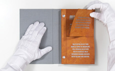 The educational book, which was designed by DDB New York, features two water filters per page, each capable of lasting for 30 days, that are made from a new paper invented by chemist Dr Theresa Dankovich. The paper is coated with silver nanoparticles, which are capable of killing up to 99.9% of bacteria in water.
DDB devised the book for the Water is Life charity whose aim is to teach people about proper sanitation and hygiene practices. According to Peter Hempel, chief executive at DDB New York, creating the book, which also contains a raft of safe drinking water tips, wasn’t without its challenges.
“The process of designing the book itself was unlike anything we’ve done before, simply because of all the variables that were beyond our control,” says Hempel. “When we received our first sample of the paper we saw immediately that the beautiful orange colour of the paper was going to be dominant in the overall look.”
While this wasn’t too much of an issue, the question of how to bind the book, due to the thickness of the stock, was. Perfect binding or stitching the pages together wasn’t possible, according to Hempel, so in the end the sheets had to be bound with posts.
Another problem was finding an ink fit for purpose given that the pages would ultimately be used as water filters. “Most commercial printing inks contain nasty chemicals that you really wouldn’t want to ingest. Even modern soy-based inks are often only 20% soy and aren’t something we’d want people drinking. We eventually found a vendor who was willing to create a food-grade ink – the same stuff you’d find on the inside of food packaging – specifically for letterpress,” explains Hempel.
The books were printed letterpress as it gave the team greater control over the process, with Jamie Mahoney at Bow House Press in the US providing invaluable assistance to the DDB team.
“She was very accommodating when it came to cleaning out the presses and making sure we weren’t going to transfer anything harmful onto the paper,” says Hempel. “Her contributions were absolutely vital to getting this project produced, particularly when it came to securing the food-grade ink.”
The type and design elements had to be kept relatively simple as the book was printed using photopolymer plates – the team also stuck to one colour to keep costs down. So far the books have only been produced for distribution in Kenya, but the ultimate goal is to produce Drinkable Books for each of the 33 countries that Water is Life operates in, explains Hempel.
“The response so far has been overwhelmingly positive,” he adds. “Water is Life has been inundated with requests for books from all over the world and several organisations have expressed interest in aiding in the mass production of the books.”
Water is Life and Dankovich are preparing to do further field testing and research this August, with the aim of undertaking a full-scale launch of the filter paper next year.
4: Pop goes the poster
 Dutch graphic design agency Trapped in Suburbia had been fascinated for some time by the idea of how to enhance the general public’s experience of a poster by merging analogue and digital. After developing two ‘Sound Posters’ – the second of which invited people to touch a printed keyboard that played music – they wanted to devise a Sound Poster 3.0 with a bang.
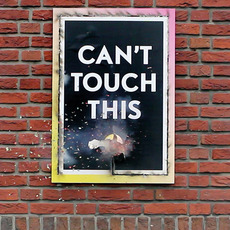 “I think the mischievous teenage attitude came into play here and we thought it would be amusing if we could make a poster explode,” says Richard Fussey, a designer at Trapped in Suburbia. “Throughout our work, we want to play with people’s emotions and curiosities – a poster reading ‘can’t touch this’ immediately spurs individuals to do the opposite.”
The studio’s experiences developing Sound Poster 1.0 and 2.0 meant that it had a head start when it came to the technological aspect of creating an interactive poster that used touch sensors and Arduino – an open-source electronics platform. But with version 3.0 requiring a special blend of ink, Trapped in Suburbia was venturing into the unknown.
“We had to create a functioning blend of ink and gunpowder type substances until it worked effectively,” says Fussey. “
The studio also had to spend a significant amount of time finding the right substrate. “We had to find the right balance of flammability,” says Fussey. “Initially the paper would not burn enough, then others would completely set alight. We found that the paper weight and whether it was coated or not really affected the result.”
The resulting Sound Poster 3.0 (a video of which can be viewed at bit.ly/soundposter3) has the words ‘can’t touch this’ printed in the middle alongside a large dot. When the dot is pushed it ignites a fuse wire running around the edge of the poster, which ultimately feeds back to the dot to trigger an explosion.
Fussey says that since unveiling the poster the studio has had lots of interest from galleries and design festival organisers, with Sound Poster 3.0 already shown in Belgium, France and Holland.
“We have also had lots of interest from print and technology-based organisations and in turn we have given several lectures at conferences. There have also been regular enquiries from advertising agencies and some big brands regarding using the poster technology in a campaign. These enquiries are yet to bear fruit, but maybe one day soon,” says Fussey.
5: Scratching the surface
 The prominence of bus shelter adverts at street level means that they’re a highly effective form of advertising. At the same time, their ubiquity means they’re often ignored as they simply melt into the street architecture.
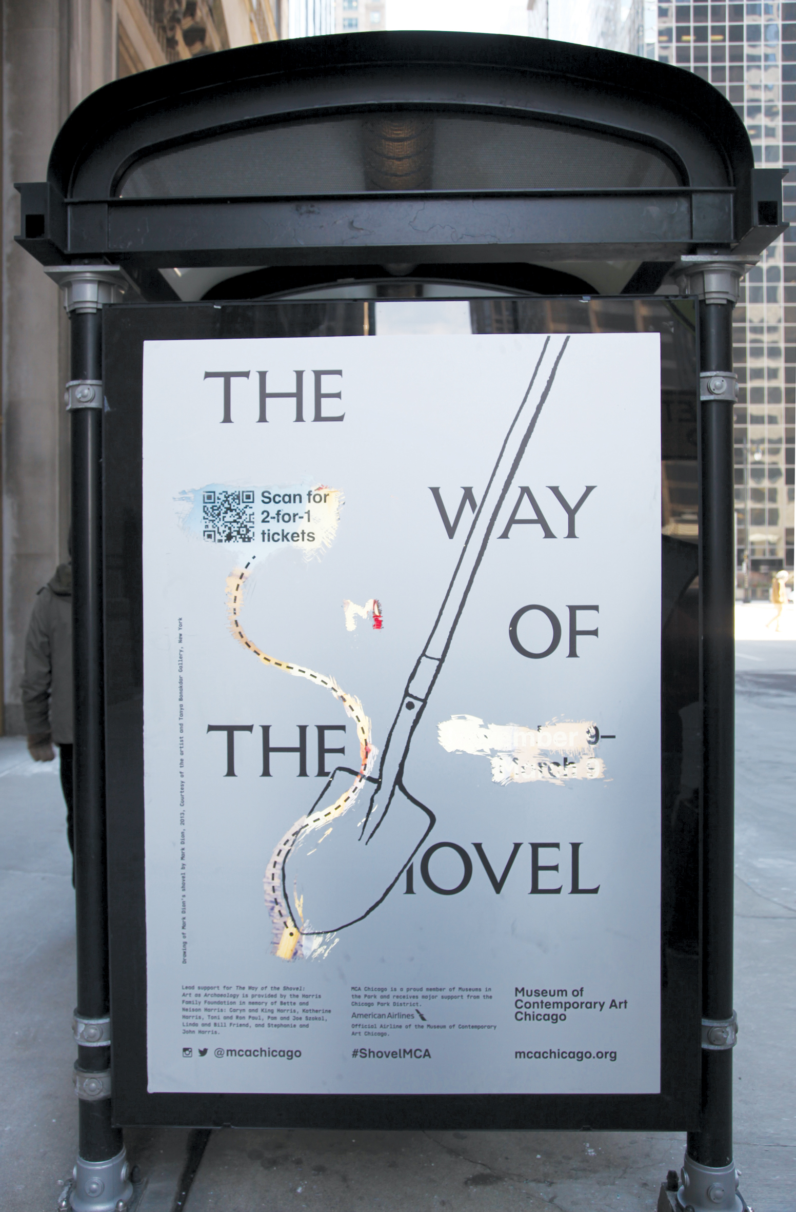 That’s why marketers have started to dream up ever more ingenious ways of creating bus shelter ads that really engage with pedestrians. It’s a trend best reflected by JCDecaux’s campaign for the Museum of Contemporary Art (MCA) Chicago’s The Way of the Shovel: Art as Archaeology exhibition.
The thinking behind The Way of the Shovel, which explores contemporary artists’ interests in history, archaeology and archival research, was to get people to ‘dig’ to discover new things. The campaign dreamed up by JCDecaux North America was a scratch-off bus shelter poster printed on a backlit clear plastic, that “allowed the public to go on their own archaeological hunt by digging beneath the surface – quite literally – of the bus shelter’s poster,” says Angela Auletta, marketing analyst at JCDecaux. “The call to action was discounted admission and the opportunity to mark up a piece of public space with no worries about ramifications. The pay-off for MCA was publically created art.”
Matthew Renton, director of communications and community engagement at the MCA, adds that the posters really caught the public’s attention and drove awareness and interest in the exhibition.
“This campaign was inspired by today’s audiences, who are increasingly interested in participation,” he says. “These ads encourage people to have an experience and become enthusiastic about the themes of the exhibition: artists uncovering and revealing history. By inviting audiences to scratch away at the surface of the poster and create their own art, they mimic the artists in this exhibition who are similarly peeling away layers to create something new.
“We view it as an outlet – a way to say to our audiences ‘go ahead, make your mark,’ but the confines of the poster and its location mean that it’s contained and transitory. Once the show is finished it disappears.”
6: New faces for historic building
 Acclaimed French street artist JR’s modus operandi has historically been to paste large black and white printed photographic images on the walls of cities in the middle of the night. But since winning the 2011 TED Prize, JR has been toiling away on his Inside Out project. This involves a mobile photo booth that goes around major global cities taking portrait pictures of members of the general public that are then instantly printed on the spot. At the annual Arles photography exhibition in 2011, JR installed an HP Designjet Z6200 large-format inkjet photo printer on a mezzanine level 12m above the floor, with the finished printed portraits drifting down to the waiting public below.
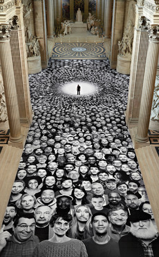 Earlier this year JR undertook his most ambitious project to date when the French government commissioned him to create an installation covering the floor, cupola and dome of the Panthéon in Paris, currently being restored. The aim was to continue to draw people into the building while it was being restored.
After collecting portraits of members of the public throughout March from his mobile photo truck, 4,160 portraits of anonymous individuals were created that were then affixed to the vast self-supporting scaffolding system that had been erected.
A spokesman for the Centre des Monuments Nationaux in France explains that “for the first time the hoardings installed around a national monument will be used to present a contemporary artistic venture instead of a lucrative advertising campaign”.
He adds: “JR is renowned for the symbolic value of his participatory projects and has brilliantly managed to encapsulate the humanistic and universal dimension of the building.”
7: Boxing clever
 Red Fuse Communications’ Hong Kong office turned the notion of ‘thinking outside the box’ inside out when it was tasked with coming up with a visually arresting, but at the same time highly functional piece of print for oral hygiene brand Colgate.
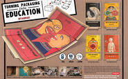 The company wanted to educate young people in Burma about the importance of dental health. There was a particular need for the campaign to reach schools in the most remote parts of the country, which also tended to boast the region’s poorest communities.
An effective way to achieve this in areas with a severe lack of basic educational supplies like pencils and books, was to produce printed posters spelling out the importance of good oral hygiene. But given the logistical challenges how could Colgate ensure that these posters would reach their target audience? The answer was to print the posters inside the large cardboard boxes used to transport the company’s iconic red toothpaste cartons.
As Colgate’s distribution network was capable of reaching even far-flung parts of the country, Red Fuse realised that the boxes could be repurposed as posters that store owners could donate to local schools once they’d decanted the products. Three different posters titled ‘cavities attack at night’, ‘good food vs bad food’ and ‘grandpa’s teeth’, were created and printed onto the boxes using traditional Burmese illustration styles. A free-to-call phone number was also set up to provide additional educational material for teachers.
The campaign was a major success. The head of one school that used the posters described them as “an inspiring solution to answer our most pressing educational needs”. The campaign landed four awards at the recent Cannes Lions festival.
8: Repellant idea increases paper sales
 Over the past few years Sri Lanka has been ravaged by dengue fever, with the number of people infected by the disease topping 30,000 in 2013 alone. As part of a creative effort to fight back, Leo Burnett Sri Lanka teamed up with Mawbima, one of the nation’s most popular newspapers, to devise an educational campaign that would be hammered home thanks to a clever printing twist.
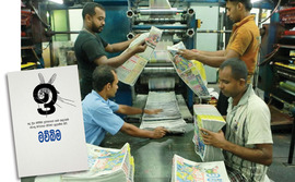 In addition to running a series of print ads and articles educating people on the different ways they can prevent contracting dengue, bus stop posters were created coated in citronella essence – a natural and effective mosquito repellent.
The posters were so effective at giving people respite from mosquito bites that the creative team at Leo Burnett decided to take the campaign a stage further to coincide with the last day of National Dengue Week. They created the twice-daily editions of Mawbima using the citronella essence to give people insect-free reading. The citronella was mixed with printing ink and used to produce the morning edition, which subsequently enjoyed a 30% sales boost.


