And, over the past decade or so, run lengths were dramatically reduced as large corporates tried to persuade shareholders to download PDF versions of these reports, thus saving themselves thousands of pounds in print and postage costs.
But then a few years ago things started to change. It’s hard to pinpoint exactly when this change occurred, but suddenly R&A brochures were full of vibrant colours, jam-packed with pictures and used all manner of innovative finishing embellishments on the cover.
One of the main reasons behind this shift is that clients wanted to start differentiating themselves from electronic rivals, believes Pressision sales manager Ian Cavanagh.
“As print is not necessarily the automatic choice to publish R&A info in, where there’s a PDF version available, the documents are now more creative with special formats, papers, processes and finishes, maximising the client’s budget,” explains Cavanagh.
You only need to look at some recent examples of R&A brochures to get a feel for this. Some corporates are now incorporating thermochromic inks, foil stamping and die-cutting to create highly engaging brochures that reflect the values of their company, says Davor Bruketa, creative director of Croatia-based advertising agency Bruketa&Zinic OM, which has received a number of industry plaudits for its work in this area over the past few years.
“The annual report may have as its primary audience the financial public, like shareholders and business partners, but it can reach further than that if the story is creative and interesting to the broader public,” says Bruketa. “This is why, together with Adris group (see boxout), we create their annual reports not only as a dry and boring bunch of papers filled with numbers and charts, but also try to illustrate these numbers in a more creative way so that when you take the report in your hands you can immediately feel its most important message. The annual report thus becomes the creative medium of corporate communications.”
The following case studies illustrate just this approach.
Nokia Siemens Network
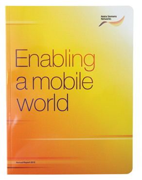
 “Quite simply stunning, impressively punchy in print and varnishing” – sounds like quite an accolade for an R&A brochure, but that’s exactly what the PrintWeek Awards 2013 judges made of the annual report that the Pureprint Group produced for mobile phone giant Nokia (thanks to its stellar work here, Pureprint won Report and Accounts Printer of the Year).
This “step-by-step essay in brilliance” started with a comprehensive proofing methodology, which entailed contract digital scatter proofs followed by retouching, then machine scatter proofs with a dual-effect coating.
According to Richard Owers, marketing director at Pureprint, bound book proofs were then produced on an HP Indigo 7500 with final proofs Epson colour-profiled to ISO 12647, along with a set of backed up and folded HP plotter proofs. Male and female artwork was created for the matt varnish areas and the overall gloss and spot plates were made on a Kodak Trendsetter and Fuji high-definition thermal plates. These used a 200-line screen profiled for the 50% recycled silk coated paper, and one profiled for the uncoated paper.
“With lots of tint work we highlighted the tint boxes by making them matt,” says Owers. “We achieved this using dual-effect coating on gloss paper, matting back the gloss while adding a gloss coating to the gloss paper. This produced a deeper gloss, contrasting with the matt, and maintaining a smooth feel free from spray powder.”
The 4pp cover was printed CMYK. The text was in CMYK with one special orange ink and with a drip coating on Amadeus 50% recycled gloss. The back text was printed in orange and black on a Heidelberg XL 105 six-colour on UPM Fine. All papers were supplied by Denmaur Paper.
The piece was folded in 16s with 2x8pp and 1x4pp sections, gathered and PUR bound. The cover was gloss laminated and drawn onto the book block and then it was three-knife trimmed before the books were individually round cornered.
JD Sports Fashion
 The key to producing a great looking R&A brochure is using the right fine paper, finding the right print supplier and creating a great design, according to Ian Cavanagh, sales manager at Pressision. For JD Sports Fashion’s annual report, Pressision worked closely with GF Smith and the design team at JD right from the project’s inception.
Cavanagh reports that the supply of “first-class dummies and mock-ups” throughout was key. The choice of three Colorplan stocks in Ebony, White Frost and Real Grey provided a “cleaner, more premium image and a great contrast for the print,” says Cavanagh. “The feel of Colorplan, along with good bulk and opacity, contributed to a document that stands out from other R&As.”
“Fine papers are built to provide a base for premium design and print and, as with any extra investment, require management of budget expectations,” continues Cavanagh. “Different formats were considered to ensure the finished product represented true value to JD Sports Fashion. Pre-production white gloss foil tests were produced in-house at Pressision on the Colorplan Ebony buckram emboss cover, to manage the creative team’s high expectations on crispness and clarity of text.”
Orbis
 While having a big budget clearly helps printers and designers to create eye-catching R&A brochures, you don’t necessarily need buckets of cash to make something look amazing. Just ask design agency Pearlfisher. Through bold design and innovative use of typography, it created an R&A brochure for eye charity Orbis that reflected the values of the organisation while still looking amazing.
Orbis is dedicated to saving sight and eliminating avoidable blindness worldwide. So it needed a visual expression for its annual review that would emotionally demonstrate the power of their work, and transform the Orbis annual review into an eagerly awaited annual publication.
The upshot of the company’s work was an “impactful graphic representation of Orbis’ life changing work, stopping people in their tracks and making them reconnect with the meaning of sight and their own ability to see,” says Chloe Charlwood, marketing and communications manager at Pearlfisher. “By weaving the facts together as a story of emotional significance and by using impactful graphics to bring the story to life, the new design expresses the charity’s commitment to visibility in everything it does.”
Electrocomponents
Previously the R&A brochure for electronics distributor Electrocomponents consisted of an A4, 4pp cover silk laminated piece, printed using a four-colour process plus two specials (one of which was a silver metallic) on a silk stock, which was PUR bound.
In the latest version of the report, printed by Park Communications, the basic set-up of the report remains the same. But the creativity levels have been ramped up through the use of a spot gloss UV varnish on the cover, which is matched with a high-gloss litho varnish in the text. The varnishes have been used to high-light key messages and images, according to Park managing director Alison Branch.
“On the cover, the impact of the UV varnish is emphasised by using a matt laminate as a base. The report also now includes an 8pp section, cut narrower than the other pages by 15mm. This short section, which sits as pages three to 10, highlights and outlines the company’s strategic plan,” explains Branch.
She adds that as budgets for the production of hard-copy R&A brochures get tighter, designers are looking to cost effective innovations, such as “more innovative and eye-catching graphics; unusual sizes; short pages to differentiate and highlight a particular section such as the strategic plan; metallic or clear foiling or spot UV on covers to highlight a key message; the addition of a textured finish to a printed cover to add a tactile interest and differentiation; using more interesting and tactile laminates than the standard gloss or matt coatings, for example soft-touch; and using metallic inks to add a touch of extra special quality”.
Bruketa&Zinic OM
 If you’re searching for inspiration, then look no further than Croatia-based advertising agency Bruketa&Zinic OM. Over the past few years the company has carved out a reputation as the go-to agency for cutting edge R&A brochures.
The company was thrust into the R&A spotlight in 2007 when it produced the annual report for Croatian food company Podravka. The report consisted of two parts: the main book containing the company’s financial details, and a small booklet inside this, containing a series of recipes. The catch was that the content of the small booklet was printed in invisible, thermo-reactive ink so to be able to read it you had to cover the booklet in foil and bake it in the oven at 100°C for 25 minutes. If the book wasn’t cooked property the pages burned, but if it was, the empty pages filled with text and illustrations.
Bruketa&Zinic OM has since produced a number of inspirational R&A jobs for regular client Adris, a Croatian investment company. In 2009, it created a dust jacket for Adris’ annual report that featured glow-in-the-dark paint. In 2010 it created a book that ‘outgrew’ its covers (the books pages spilled beyond the outer cover). In 2011 it produced a book that was deceptively heavy despite looking normal to the untrained eye. And in 2012 it used thermochromic ink on the cover that revealed floral details when heated by the palms of the hands, “metaphorically illustrating how hands can achieve anything,” explains Bruketa&Zinic OM creative director Bruketa. “The same specially calibrated thermochromic ink that was used on the cover was also used for the illustrations inside the report,” he says.
He adds that Adris is “very much aware of the communication potential an annual report can have – a view supported by the group’s corporate communications director Predrag Grubic.
“Creativity in each and every segment of business is the best path towards the success of a company and the economy in general. Creativity is thus the primary value behind Adris group, which we want to communicate through everything we do, including out annual reports,” says Grubic.


